How I Grew My LinkedIn Reach 9.6x in a Month: A 13-Month Data Case Study (2026)
“I pulled 13 months of my own LinkedIn analytics and found the exact month my reach broke out, why it happened, and whether it held. Here’s the full data trail.”
In February 2026, my LinkedIn impressions jumped from a monthly average of 975 to 9,339. That's a 9.6x increase in a single month, and it wasn't a fluke post that happened to catch a wave. The lift held for seven months afterward at roughly 2.5x my old baseline, and my follower growth rate nearly tripled over the same stretch.
I didn't run an ad campaign. I didn't buy followers. I changed what I posted about, and I have the daily export to prove exactly when it happened and what it did to every metric that matters. This is that data, laid out in full, with nothing rounded up to make the story better than it is.
This isn't a "how I went viral overnight" story, and I want to be upfront about that before you invest 20 minutes reading it. It's a small account (3,606 followers as of this writing) that spent six months doing very little, then found a repeatable pattern that roughly tripled its trajectory and held. If you're looking for a hockey-stick screenshot with no context, this piece will disappoint you. If you want to see what a realistic, mid-size professional account's actual numbers look like before and after a real change, and every table and chart it takes to show that honestly, keep reading.
Why I Turned My Own LinkedIn Analytics Into a Case Study
Most LinkedIn growth advice is either a guru's screenshot with no context or a vendor's aggregate benchmark pulled from thousands of accounts you don't resemble. I wanted something closer to a lab notebook: one account, one person, 13 months of daily impressions, engagements, and follower adds, with the exact dates a strategy shift happened.
I'm a content and SEO writer. My site, the-playbook, is where I write about AI search and content strategy for SaaS and marketing teams. My LinkedIn profile is the place I practice what I write about, in public, with the analytics turned on for anyone to check.
That matters for how much weight you should put on this piece. I'm not a growth consultant selling a course on the back of a screenshot; I'm someone who writes about content strategy for a living, running the exact experiment on my own account that I'd tell a client to run on theirs. If the pivot described here hadn't worked, this would be a much shorter and less flattering post, and I'd still be writing it, because the export doesn't lie either way.
So I exported the full dataset (August 14, 2025 through September 17, 2026) and went through it line by line. No cherry-picked screenshots. Every chart in this piece comes straight from that export, and every number is one you could reproduce yourself from LinkedIn's own analytics tab.
Three things make this worth reading even if you've seen a hundred "I grew my LinkedIn" posts before. First, the account was small and slow for six months before anything changed, which is the part most case studies skip. Second, I can show you the exact pivot date because the data has a visible seam. Third, I'm going to show you the parts that didn't work too, instead of only the highlight reel.
The Starting Point: 13 Months of Raw Numbers
Here's the account as it stood on September 17, 2026, covering the full window LinkedIn's export tool allows:
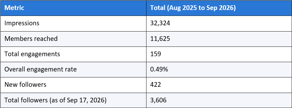
Those are unremarkable numbers for an account with over a year of history. An engagement rate under half a percent is low by any published benchmark, and I'll get into exactly how low in a later section. But the total obscures the real story, which is that this account behaved like two different accounts stitched together at one seam: six quiet months, then a break, then a new and much higher normal.
I want to be precise about what "unremarkable" means here, because it's doing real work in this piece. It doesn't mean the account was failing or that nothing of value was being posted. It means the account was producing content at a reasonable, sustainable pace and getting a level of distribution that wouldn't stand out in either direction if you saw it cold, which is exactly the kind of account most of this piece's likely readers are probably running right now. That's the point of using it as the example instead of a more dramatic before-and-after.
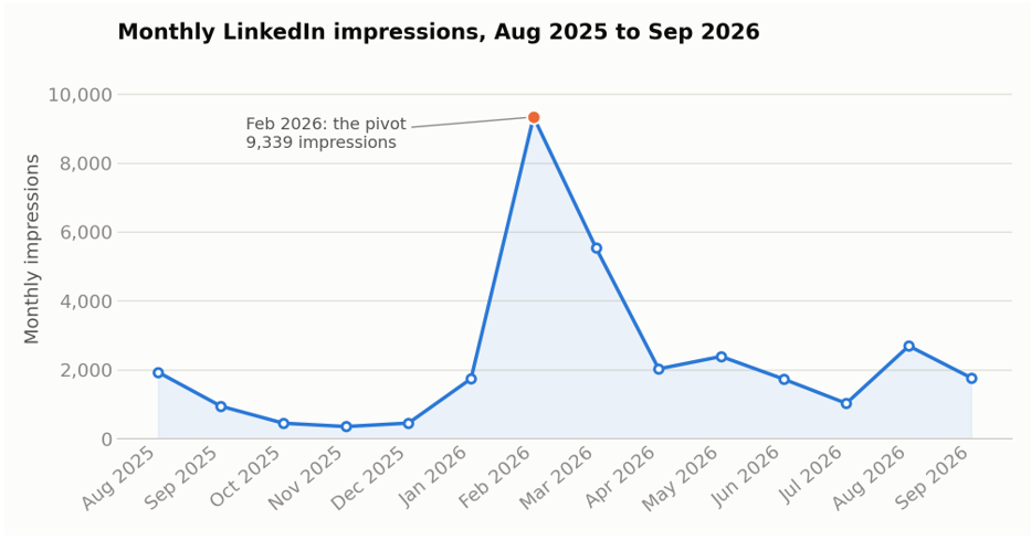
Look at the shape of that line. From August 2025 through January 2026, impressions never cracked 2,000 in a single month, and four of those six months sat under 1,000. Then February happens, and the account never fully returns to where it started.
The First Six Months: What Wasn't Working
I want to be specific about the baseline because "it was slow" doesn't tell you anything useful. Here's what August 2025 through January 2026 actually looked like, month by month:
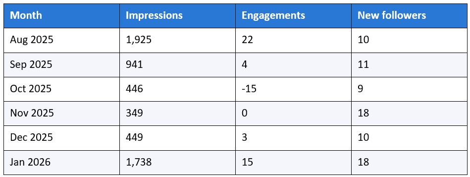
Two things stand out. The impressions were low and getting lower through the back half of 2025, bottoming out at 349 in November. And the content mix during this period was scattered: SEO and content-writing posts sat alongside photography posts, career reflections, and general marketing commentary, with no consistent thread connecting one week's post to the next.
That negative engagement number in October (-15) isn't a data error. LinkedIn's daily engagement figure is a net count, so when people remove a reaction or delete a comment faster than new ones arrive on older posts, the day can go negative. It's a rounding artifact of a small, quiet account, not a sign anything went wrong that month specifically.
I'm including that negative number rather than smoothing it out of the monthly table, along with five other negative-engagement days scattered across the full window (one in September 2025, four in March 2026), because a case study that only shows numbers that support its own narrative isn't trustworthy. None of those six days change the overall pattern in this piece, and I'd rather you see them and judge that for yourself than take my word for it.
What this baseline period actually shows is an account posting into the void: real content, reasonable frequency, and almost no signal that LinkedIn's distribution system had figured out who should see it. That's a common and rarely admitted stage, and it's worth naming because most people quit here.
The Pivot: What I Changed in February 2026
Here's what actually changed going into February, as close to a complete list as I can reconstruct from the post log:
● I narrowed the topic range. Photography posts, career-life reflections, and general marketing takes mostly stopped. What replaced them was SEO strategy, AI search, content-writing craft, and the UK content-hiring market, posted back to back, week after week.
● I posted more often and more predictably, rather than in bursts followed by silence.
● I wrote posts as specific, arguable claims ("Most of your content will never get cited," "AI isn't killing SEO, it's forcing it to get better") instead of general reflections.
● I stopped mixing personal-life content into the same feed as professional content, at least during this window.
The reason I believe the topic narrowing did most of the work, rather than frequency alone, is what LinkedIn's own distribution logic rewards. According to a 2026 breakdown of the algorithm from growleads.io, topical consistency is a direct input into who LinkedIn shows your content to next: "If a founder posts about SaaS pipeline, outbound intelligence, LinkedIn authority, AI search, and GTM execution consistently, LinkedIn has more context about who should see that content." The same source notes the opposite failure mode explicitly: an account that jumps between hiring jokes, generic motivation, and personal updates sends a weaker audience signal, which is a fair description of my own August through January feed.
There's a second mechanism worth naming: dwell time. The same analysis describes dwell time as the amount of time a reader spends on a post before scrolling past, and it matters because most readers never like, comment, or share; they just read or skip. Specific, expertise-driven claims like "most of your content will never get cited" are built to make a scrolling reader stop and actually read the argument, which is exactly the passive signal dwell time is designed to capture.
Engagement quality beyond engagement speed
One more detail from the same source is worth pulling out on its own, because it reframes how I now read my own engagement numbers. Early reactions on a post do help it reach second- and third-degree connections, but the source is explicit that speed alone isn't the whole story: "a fast burst of random likes is less valuable than a post that gets saved by a VP Sales, commented on by a CFO"
I can't verify from my own export which specific people commented on which posts, since LinkedIn's aggregate demographics data doesn't tie individual engagers back to individual posts. But it reframes the seniority-engagement gap I found later in this piece: a smaller number of engagements from a more senior, more relevant commenter may be doing more distribution work than a larger number from a broader audience, even though my export can only show me the total count, not the weighted value LinkedIn's own system might assign it.
February 2026 by the Numbers
The month itself, isolated:
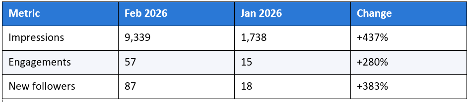
Five of my ten highest-traffic days across the entire 13-month window fall inside a single five-day stretch: February 9 through 13, 2026, ranging from 716 to 1,016 impressions per day. For comparison, the entire month of November 2025 generated 349 impressions total, less than one of those single days in February.
The posts driving that week were squarely inside the new, narrower topic lane: a piece on the UK content-writer hiring market, a post questioning whether a given writer actually understands SEO, and a piece on fixing SEO for 2026 by optimizing for citations rather than keywords alone. None of them were photography or personal-life content. All of them made a specific, checkable claim in the first line.
Posting cadence, by the data
I don't have a clean total-posts-per-month count in the export, since LinkedIn's Top Posts tab only lists the 50 best-performing posts across the whole window, not every post I ever published. But that list is still useful as a proxy, because it tells you how many posts were good enough to crack LinkedIn's own top-50 ranking in any given month.
Across the full 13 months, 37 distinct posts appear somewhere in that top-50 list. Sixteen of them, 43% of the total, were published in February 2026 alone. January 2026 has 2, March has 5, and every other month has 3 or fewer. Whatever else changed that month, I was also simply publishing far more often, and a much higher share of what I published cleared LinkedIn's own bar for a top-performing post.
That's consistent with published guidance on the platform: Sprout Social's 2026 breakdown of the algorithm notes that "for personal accounts, publishing daily or more often isn't uncommon," and that LinkedIn tests each post's distribution against portions of your network before deciding whether to expand its reach further. More posts simply means more chances for that test to succeed, on top of whatever the topic-consistency signal was doing.
Did It Stick, or Was It a Fluke?
A single great month proves nothing on its own. Plenty of accounts get one viral post and go quiet again. So I want to show you the seven months after February, because that's the part that actually answers whether this was luck or a real shift.
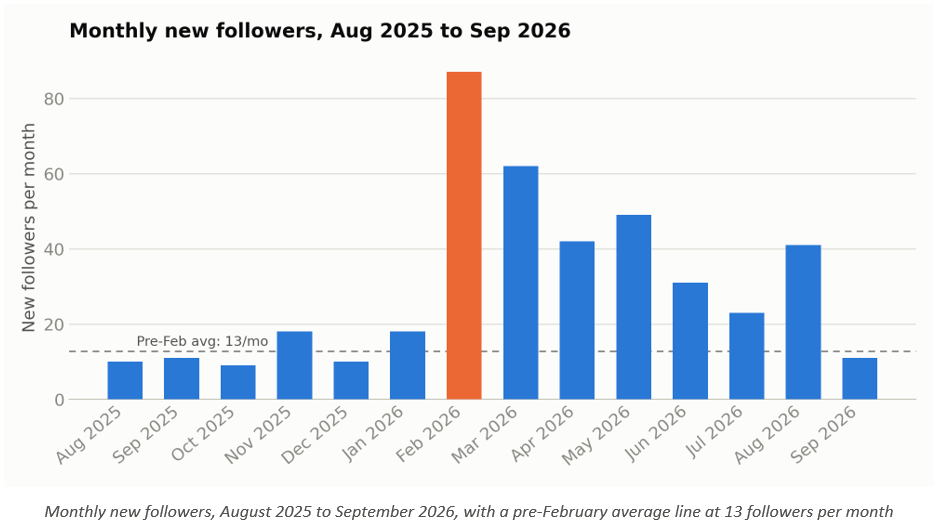
Here's the month-by-month follower count from March through September 2026:
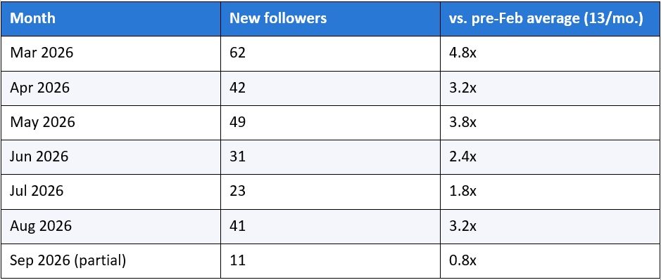
Every single month from March through August ran at least 1.8 times the pre-February baseline, and most ran 3 to 5 times higher. Impressions tell the same story: the pre-February average was 975 a month, and March through September averaged 2,448, a sustained 2.5x lift that has now held for seven consecutive months.
September dipped back toward baseline, which is worth being honest about rather than glossing over. I posted less frequently that month, and the data backs up my own instinct here: consistency, not a single good idea, is what the algorithm keeps rewarding. One strong week doesn't buy permanent higher reach; it buys a temporarily wider net that needs feeding.
The Top 8 Posts, Ranked by What Actually Earned Engagement
Impressions measure how many people saw a post. Engagement measures how many of them cared enough to react, comment, or share it. Those are different questions, and ranking by the wrong one will point you at the wrong lessons.
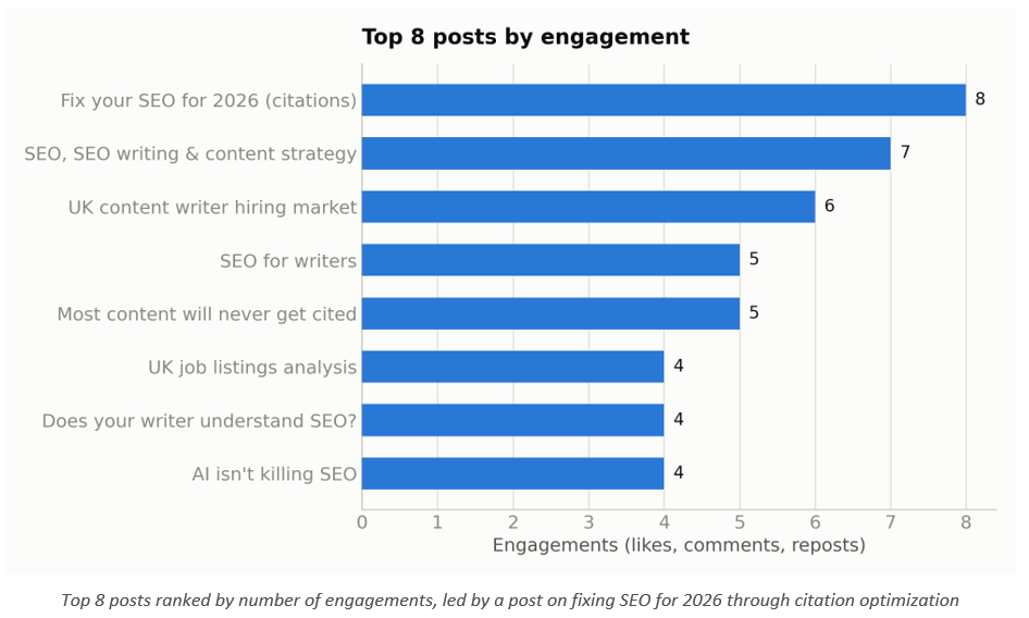
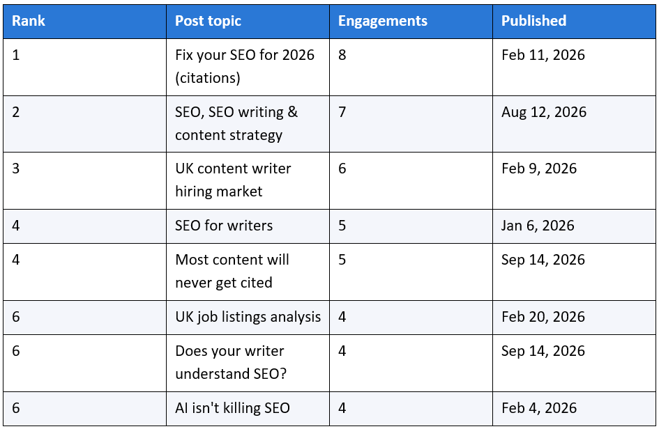
Every single post in my top eight by engagement is professional, expertise-driven content about SEO, content strategy, or the content-hiring market. None of the personal or photography posts make this list, despite several of them pulling solid impression counts.
That split matters more than the raw numbers suggest. Buffer's 2026 LinkedIn data set found that thought-leadership content generates six times more engagement than job-related posts on the platform, which lines up almost exactly with what my own account shows when you separate the two content types. Impressions can come from almost anything if the algorithm decides to test a post widely. Engagement is a much better read on whether the specific people it reached actually cared, and on my account, the expertise content wins that comparison decisively.
The highest-impression post of the whole window, by contrast, is a post about translation services published in December 2024, nearly a year before this reporting window even starts. I'll come back to that one, because it's one of the stranger and more useful findings in the whole dataset.
What didn't make the list
It's just as informative to look at the bottom of LinkedIn's own top-50 ranking as the top. The lowest-engagement posts that still cracked the list sit at a single engagement each, and every one of them I checked is a photography post: forensic photography, seal photography at Newburgh beach, a piece on how photography improved something else, a post on planning photography around a working schedule. Solid photos, clearly personal to me, and almost no engagement from this specific audience.
That's not a coincidence lining up with the top-of-list pattern; it's the same finding from the other direction. The professional, SEO-and-content-strategy posts occupy the top of the engagement ranking and the photography posts occupy the bottom, with almost nothing in between blurring the line. If your own top-50 export shows a similarly clean split by topic, that's a strong signal about which topic your specific audience actually showed up for, whatever you originally built the account to be about.
Who Is Actually Seeing My Content
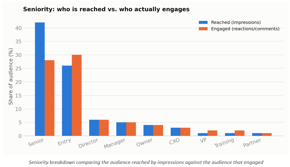
Reach only matters if it reaches the right people. LinkedIn's audience data splits into two separate groups worth comparing: the people who were reached by an impression, and the smaller group who actually engaged.
The seniority split for the reached audience:
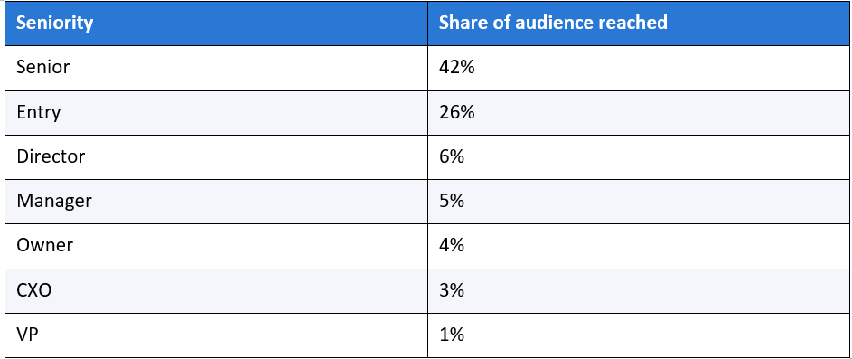
Forty-two percent of the people my posts reach are classified as senior-level, and another 14% sit at Director, Owner, or CXO. That matters beyond vanity, because LinkedIn's own audience carries real purchasing authority: Buffer cites that 80% of LinkedIn members are involved in business decisions at their company, and that the platform's audience holds roughly twice the buying power of the average online audience (Buffer, 2026). Reaching a senior-skewed audience on this specific platform isn't the same as reaching a senior-skewed audience anywhere else online.
That same Buffer data set adds a related point worth folding in here: 59% of B2B decision-makers say they prefer creator content over other types of content on LinkedIn, and roughly 40% of people who visit a company page engage with it weekly through a follow, a like, or a click. Put together with the seniority numbers above, that's a reasonable case for why a personal account, even a small one, can be a more efficient way to reach senior B2B buyers than it might look from the raw follower count alone. A senior decision-maker who prefers creator content over brand content is, by definition, more likely to see and act on a personal post like mine than an equivalent post from a company page with a far larger follower count.
I'd still caution against reading too much certainty into that framing. My own data shows this account reaching senior people; it doesn't show those specific people converting into clients, replies, or revenue, and I don't have a clean way to measure that from LinkedIn's export alone.
The Gap Between Who Is Reached and Who Engages
Here's where it gets more interesting, and where the chart above earns its place. The audience that actually engages with my posts skews noticeably younger and more junior than the audience that merely sees them.
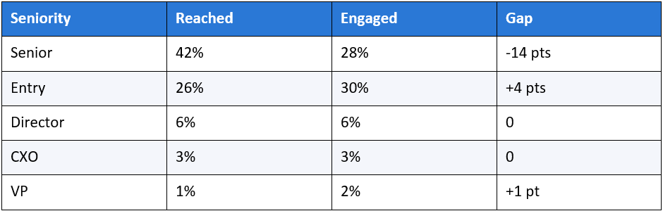
Entry-level professionals are slightly overrepresented among engagers relative to how often they're reached, while senior professionals are meaningfully underrepresented in the engaged group compared to how often they show up in impressions. In plain terms: LinkedIn is showing my content to a lot of senior people, but the people actually stopping to react are disproportionately more junior.
The engaged audience's job titles back this up. Content Writer, Search Engine Optimization Specialist, and Writer all appear among the top job titles for people who engage, while Professor, Founder, and Chief Executive Officer dominate the job titles of the people who merely see the content without engaging. That's a fairly intuitive pattern once you see it stated plainly: peers in your exact field are more likely to stop and comment than a senior executive scrolling past on their way to something else, even when the executive is technically in the reached audience.
If your goal is client acquisition from senior decision-makers, this gap is the actual metric to watch, not overall engagement rate. A post can look successful by raw engagement while mostly resonating with your peers rather than your buyers, and the only way to catch that is to compare these two audience breakdowns directly rather than reading either one in isolation.
This is also the clearest argument I've found for why "vanity metrics" isn't just a slogan people use to sound sophisticated. Impressions and follower count are real numbers, not fake ones, but they answer a narrower question than most people treat them as answering. They tell you how many people saw something, not who found it worth their time. A single side-by-side table like the one above, built in a few minutes from an export you already have, answers the second and more useful question directly, and I'd guess most accounts that feel like they're "growing but nothing's happening" have exactly this gap sitting unexamined in their own data.
The Industries and Company Sizes Showing Up in My Numbers
Two more cuts of the reached-audience data round out the picture: industry and company size.
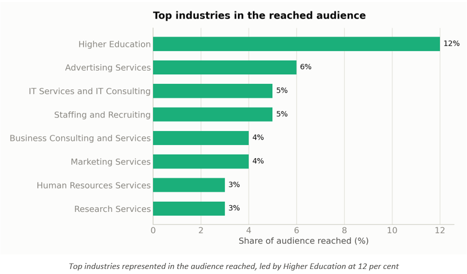
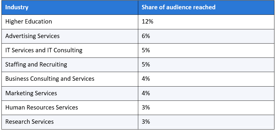
Higher Education leads by a wide margin, which surprised me until I cross-referenced it against job titles: Professor and Lecturer both appear in the top nine job titles for the reached audience, which suggests LinkedIn's topic-matching is pulling in academics interested in SEO and content strategy as a subject, likely alongside genuine marketing and advertising professionals.
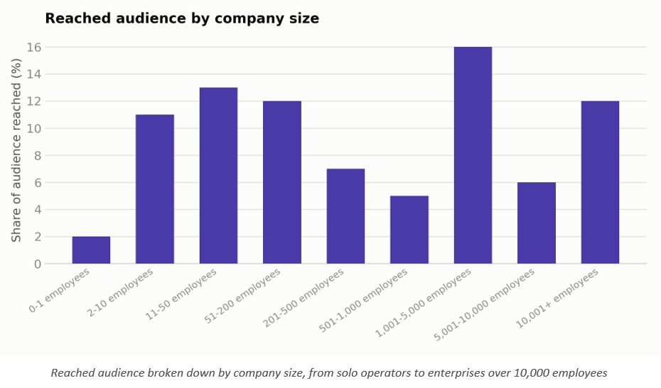
Company size tells a more fragmented story: no single band dominates. The 1,001 to 5,000 employee range leads at 16%, but 11 to 50 employees (13%), 51 to 200 employees (12%), and 10,001-plus employees (12%) all sit close behind. That spread across small, mid-size, and enterprise organizations suggests the content is resonating on the substance of SEO and content strategy rather than on a company-size-specific pain point, which is either a strength (broad relevance) or a sign I haven't yet niched the message enough to concentrate the audience in one buyer segment. I genuinely don't know which yet, and I'd rather say that than force a tidy conclusion the data doesn't support.
The industry mix shifts once you look at who engages rather than who's reached. IT Services and IT Consulting jumps to the top of the engaged list at 9%, ahead of Advertising Services and Marketing Services at 5% each, while Higher Education, the leader on reach, drops to 3% among engagers.
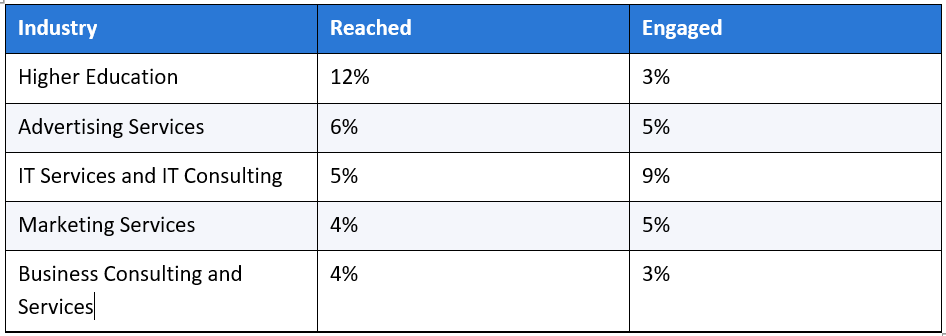
That gap fits the academic-audience theory from the reach numbers: a lot of the Higher Education impressions likely come from professors and lecturers who see the content because it matches their subject interest, not because they're evaluating it as a potential hire or client. The IT Services jump among engagers is the more commercially interesting signal, since that's an industry actually reading and reacting rather than passively appearing in the reach count.
Company size for the engaged audience follows a similar pattern to the reach numbers, without a single dominant band: 11 to 50 employees leads at 12%, with 10,001-plus and 51 to 200 close behind at 11% each. The practical read is the same one I gave for the reach data. This account isn't yet concentrated in one buyer segment by company size, for better or worse.
Job titles tell a cleaner version of the same story I found in the seniority breakdown. Professor, Founder, and Lecturer lead the reached audience's job titles, while Founder, Content Writer, and Search Engine Optimization Specialist lead the engaged audience's. Founder is the one title that shows up strongly in both groups, which makes it the closest thing this account has to an audience that both sees and reacts to the content in real numbers.
Where My Audience Is Actually Located
LinkedIn's demographics tabs also break the audience down by location, and this is the section where I found something I genuinely can't fully explain.
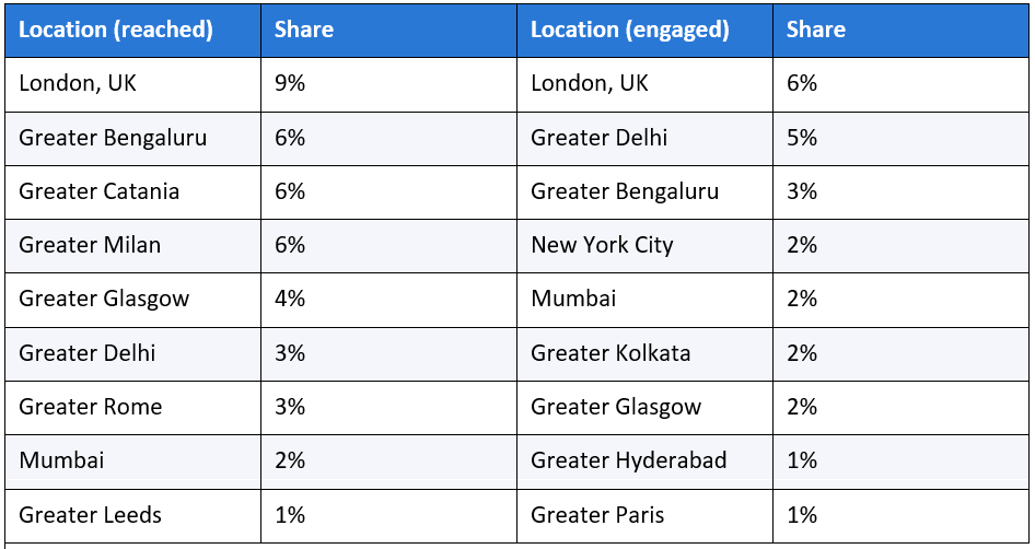
London leading both lists makes sense given my own UK base, and Bengaluru and Delhi showing up strongly fits the size of India's content-writing and marketing workforce. What doesn't have an obvious explanation is Catania and Milan, two mid-size Italian metro areas, each accounting for 6% of my reached audience, on par with London and ahead of every Indian city except Bengaluru.
I don't have a confirmed cause for this. It could be a single well-connected follower in that region whose own network overlaps heavily with mine, a specific post that got picked up or reshared locally, or something in LinkedIn's topic-matching that I'm not aware of. I'm flagging it rather than explaining it away, because the honest answer is that I don't know, and if you pull your own export and see a similarly unexplained geographic cluster, it's worth investigating rather than assuming it's noise.
One useful pattern despite that anomaly: the engaged audience's geography is more evenly spread across nine distinct regions than the reached audience's, which is concentrated more heavily in the top three. That's a small piece of evidence that engagement, unlike raw reach, isn't being driven by one or two unusually large clusters.
The company data in the same demographics tabs tells a much less interesting story, and I want to include that too rather than only showing the sections with a clear finding. No single company accounts for more than a fraction of a percent of either the reached or the engaged audience; the list is fragmented across dozens of employers, mostly universities, public-sector bodies, and small consultancies, with nothing resembling a concentrated cluster. For an account this size, that's the expected shape rather than a surprising one, and it's worth stating plainly rather than stretching a thin finding into a section that doesn't earn its place.
The Post From 14 Months Ago That Still Outperforms New Content
This is the single strangest line in the entire dataset. A post about translation services, published December 6, 2024, sits at 1,083 impressions, the second-highest of any post in a window that technically starts August 14, 2025, eight months after that post went up.
That post is still being served impressions well over a year after publication, at a volume that beats almost everything I've posted since, including content published deliberately during the February growth spike. The only other post with more total impressions in this window is a March 2026 piece on content strategy, at 1,086, a margin of three impressions.
I can't fully explain this from the export alone; LinkedIn doesn't tell you why a specific post keeps surfacing. But it's consistent with something a 2026 breakdown of LinkedIn's ranking system describes: the platform tests posts continuously against portions of your network rather than showing everyone a post once and moving on, and strong dwell-time or engagement signals can keep a post circulating well past its original publish window (Sprout Social, 2026). Whatever the mechanism, the practical lesson is straightforward: a small number of posts appear to have long-tail discovery value that has nothing to do with when you published them, and it's worth knowing which of your old posts are quietly still working before you assume everything old is dead.
The Framework I'd Give Someone Starting From Zero
I don't love naming things after myself, but this pattern is specific enough and repeated enough across my own data that it's worth giving it a name rather than describing it fresh every time: Expertise-First Posting. The rule is simple to state and harder to actually stick to.
Post primarily inside one professional topic lane, make every post a specific and checkable claim rather than a general reflection, and treat personal or lifestyle content as a separate, occasional category rather than something interleaved every few posts. Here's the version of that rule broken into steps:
1. Pick one professional topic lane and write down what's explicitly outside it. For me, that's SEO, AI search, and content strategy; photography and general career reflection are explicitly outside it, at least on the feed I want the algorithm to learn from.
2. Open every post with a specific, arguable claim rather than a scene-setting sentence. "Most of your content will never get cited" earned 5 engagements and cracked my top posts list; a softer, hedged version of the same idea almost certainly wouldn't have. This lines up with a separate 2026 finding on LinkedIn content phrasing: posts built around a concrete lesson or an admitted mistake, phrases like "here's what I learned" or "this mistake cost us," see 280% higher engagement than posts built around generic corporate language, according to Grow with Ghost's 2026 analysis of LinkedIn personal branding content (Grow with Ghost, 2026).
3. Post on a predictable cadence rather than in bursts. My November 2025 low point (349 impressions) followed weeks of inconsistent posting; my best months followed weeks of steady, near-daily posting.
4. Separate personal content from professional content by time or format, don't interleave them post to post. The algorithm's relevancy signal, per the LinkedIn breakdowns I've cited above, is partly built from what you post about consistently; mixing signals weakens it.
5. Check engagement before deciding a post "worked," rather than impressions alone. My top-engagement posts and my top-impression posts only overlap on two of sixteen total entries; impressions alone would have pointed me at the wrong lessons.
The clearest before-and-after example in my own post history is the difference between a September 2025 post about ways students can make money using free tools, a broad, listicle-style topic outside my core lane, and the February 2026 post on fixing SEO for 2026 through citation optimization, a narrow, specific, arguable claim squarely inside it. The September post pulled a modest 243 impressions and 2 engagements. The February post pulled 360 impressions and 8 engagements, the single highest engagement count of any post in the entire 13-month window. Same author, same follower base at the time, a five-month gap, and a completely different topic-and-claim strategy.
None of this is exotic. What makes it useful isn't originality, it's that I can point to the exact before-and-after data in this piece and show you it actually moved the numbers, rather than asking you to take a stranger's word for it.
I'd also add a sixth, softer step that doesn't fit neatly into a numbered checklist: give the approach longer than a week before judging it. My own account posted consistently within the new topic lane for close to two weeks before the February numbers started climbing, and a single post the day after you decide to narrow your focus is unlikely to look any different from a post the day before. The shift shows up in the trend, not in any one post, which is exactly why this piece leans on monthly tables instead of a single screenshot.
Mistakes I Made That Cost Me Reach
In the spirit of showing more than the highlight reel, here's what I'd do differently:
● I let six months pass with a scattered topic mix before I diagnosed the problem. The data suggests the algorithm needed a consistent signal to work with, and I didn't give it one until month seven, which is six months of reach I likely left on the table simply by not reviewing my own numbers sooner.
● I have posted almost no native documents or carousels, the single highest-engagement format on the platform according to Socialinsider's 2026 data (7.00% average engagement versus 4.50% for text). That's a lever I haven't touched at all, despite it being the single most well-supported format lift in every benchmark I found while writing this piece.
● I let September 2026 slide back toward a lower posting frequency, and the impressions and follower numbers dipped in step. Consistency isn't a one-time fix; it's an ongoing cost, and I underestimated how quickly the account would give back momentum once I stopped feeding it at the same rate.
● I didn't track which specific claim, hook, or opening line correlated with engagement until I built this analysis. I was publishing on instinct rather than reviewing my own numbers regularly, which meant I couldn't have told you why February worked until I sat down and built the tables in this piece.
● I never tested the personal-content-as-a-separate-track idea deliberately; it happened as a side effect of narrowing my professional topics, not as a planned experiment. I don't actually know yet whether occasional personal posts help or hurt reach within an otherwise consistent professional feed.
● I haven't added image captions to any visual posts I have published, despite Buffer's 2026 data showing captioned image posts earn roughly twice the comments of uncaptioned ones (Buffer, 2026). It's a small, low-effort fix I simply hadn't gotten around to until writing this piece forced me to look at the gap directly.
Each of these is a specific, fixable behavior rather than a vague regret, and that's deliberate. "Post better content" isn't an actionable note to myself six months from now. "Add native documents, because they earn 7.00% average engagement against 4.50% for text-only posts, and I currently publish zero of them" is something I can check off or fail to check off, and the data will tell me which happened.
I'd also rather list five real mistakes than round up to a cleaner-sounding "top three lessons," because two of these (the September slide-back and the untested personal-content question) don't fit neatly into a tidy narrative. They're still true, and they're still useful to know before you copy this approach onto your own account.
What I'm Changing Next
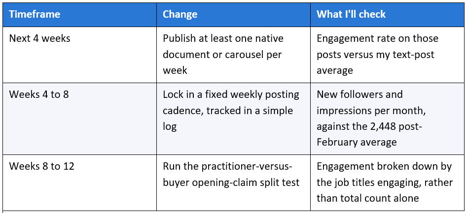
Based on everything in this dataset, three changes are going into my next few months of posting, in order of how confident the data makes me:
First, native documents and carousels. This is the clearest gap between my format mix and the highest-performing format on the platform, and it's the one change with a real published benchmark (7.00% versus 4.50% engagement) behind it rather than just my own small sample.
Second, a fixed weekly cadence rather than the burst-and-pause pattern visible in the monthly chart. Buffer's 2026 data found that pages posting weekly see 5.6 times more follower growth than less consistent posting patterns, which is directionally exactly what my own November-to-February comparison shows (Buffer, 2026).
Third, a deliberate split test on the seniority-engagement gap. My working theory is that content written explicitly for practitioners (other writers and SEO specialists) will keep converting well on engagement, while content written explicitly for buyers (a founder or CXO deciding whether to hire a content strategist) needs a different opening claim to earn a stop-and-read from that specific audience. I don't have the data to prove that yet; it's the next thing I intend to measure rather than assume.
Here's roughly how I'm sequencing it, month by month, so this section is a plan rather than just an intention:
I'm publishing this plan in the piece itself, publicly, specifically so there's a record to hold myself to when I write the follow-up. A prediction that only gets checked when it's convenient isn't a real prediction.
What This Actually Cost Me in Time
Case studies tend to skip this, so I want to include it. None of the growth described here came from a tool, a paid promotion, or a team. It came from writing more often, about a narrower set of topics, and it took real time to do that.
During the February surge, I was writing and publishing close to daily, which realistically meant 30 to 45 minutes of writing per post on the days I posted, plus the time spent actually doing the SEO and content-strategy work I was writing about, since most of the posts were direct observations from client work rather than researched-from-scratch pieces. I didn't track hours precisely enough to give you a clean weekly total, and I'd rather admit that gap than manufacture a precise-sounding number I can't stand behind.
What I can say honestly is that the September dip lines up with a period where I had less time to give it, not less belief in the approach. That's consistent with the framework's core claim: this isn't a trick that keeps working once you stop feeding it, it's a pattern that requires the same input (consistent, on-topic posting) to keep producing the same output. If you're weighing whether this approach fits your own schedule, budget for near-daily writing during any month you want a result like February, not an occasional post when you find time.
Final Thoughts
Thirteen months of daily data point to one conclusion I'm confident standing behind: topic consistency, not raw effort or post count, is what changed this account's trajectory. I was posting real, reasonable content for six months before February and getting almost nothing back for it, and the difference wasn't that I suddenly started trying harder. It's that I gave LinkedIn's distribution system a clear, repeated signal about who should see my content, and it started acting on that signal within weeks.
The uncomfortable part of that conclusion is that it means the first six months weren't wasted exactly, but they also weren't going to fix themselves no matter how much longer I'd kept posting the same scattered mix. If your own analytics look like my August-through-January numbers, more of the same probably isn't the answer. A narrower, more consistent topic lane, checked against your own engagement data rather than impressions alone, is the change worth testing first.
I also want to leave you with the parts of this dataset I haven't resolved, because a case study that pretends every question has a tidy answer is doing you a disservice. I don't know why Catania and Milan show up so strongly in my reached audience. I don't know whether an occasional personal post helps or hurts an otherwise consistent professional feed. I don't know yet whether the practitioner-versus-buyer split I'm planning to test will actually show a difference. Those are the honest boundaries of what 13 months of one account's data can tell you, and I'd trust this piece less if I'd smoothed them over to make the conclusion sound cleaner.
If you take one action away from this, let it be the audit, not the framework. Pull your own export, build the monthly view, and compare your reached and engaged demographics side by side before you change anything. The framework only mattered because the data told me what to change; without your own numbers, you're guessing at a version of my answer instead of finding your own.
I'll be back with an update once I've run the carousel and weekly-cadence changes long enough to have real numbers on them, not projections.
Frequently Asked Questions
Is a 0.49% LinkedIn engagement rate bad?
It's below the 2026 published averages, which range from roughly 5.2% to 6.5% depending on the source and are based mostly on business page data rather than personal profiles (Socialinsider, 2026; Buffer, 2026). For a small personal account without carousel or native-document content, it's a realistic starting point rather than an alarming one, and the more useful number to watch is the trend, not the single figure.
How long does it take to see a shift like this on LinkedIn?
In my data, six months of consistent-but-scattered posting produced almost no reach growth, and the shift happened within the first month of narrowing the topic focus and tightening the posting cadence. That's one account's timeline, not a guarantee, but it matches what LinkedIn's own algorithm documentation describes about topical relevancy building up as a signal over repeated posts rather than a single one.
Does posting frequency matter more than topic focus?
In my own data I can't fully separate the two, since I changed both at the same time in February 2026. Published research suggests both matter independently: Buffer's data shows a 5.6x follower-growth advantage for weekly posting, while LinkedIn's own ranking logic, per the 2026 breakdowns cited above, explicitly rewards topical consistency as a distribution signal. My honest read is that you need both, not either.
What's the fastest way to know if my own account needs this kind of pivot?
Pull the same monthly impressions and follower table shown in this piece, going back as far as your export allows. If the line is flat or declining for more than a couple of months and your topics are scattered across unrelated subjects, that's the same starting position I was in, and the same fix is worth testing. If your line is already climbing steadily, the more useful next step is probably the reached-versus-engaged demographic comparison instead, to check whether the growth you already have is reaching the audience you actually want.
Why does one of my oldest posts still get more impressions than new ones?
I don't have a definitive answer, and I'd be skeptical of anyone who claims certainty here without access to LinkedIn's internal systems. The most plausible explanation, based on public descriptions of how LinkedIn continuously re-tests posts against portions of your network, is that a post with unusually strong dwell time or engagement signals can keep circulating well past its original publish date.
Should I stop posting personal content on LinkedIn entirely?
My data doesn't support that conclusion, and I'd be overstating my own findings if I claimed it did. What the data shows is that my expertise-driven, professional posts substantially outperformed personal or lifestyle posts on engagement specifically. Whether an occasional, deliberately placed personal post helps or hurts an otherwise consistent professional feed is a separate question I haven't tested yet.
What tool did you use to build this analysis?
Nothing beyond LinkedIn's own built-in analytics export and a spreadsheet. The workbook LinkedIn generates from your profile's analytics tab, described in the methodology section above, was the only data source for every number and chart in this piece. No third-party analytics platform was involved.
How often should I actually check my own LinkedIn analytics?
I didn't check mine often enough during the six flat months, which is part of why they lasted six months instead of two or three. A monthly check is enough to catch a trend like the one in this piece; a weekly glance at which of your last few posts pulled the most engagement, rather than impressions alone, is enough to start noticing the topic pattern before it takes half a year to become obvious.
Does this Expertise-First approach generalize outside SEO and content writing?
I only have data on my own niche, so I can't claim certainty here. But the mechanism I've described, topical consistency as a distribution signal and dwell time as a quality signal, isn't specific to SEO content; it's a description of how LinkedIn's ranking system reads any account's posting pattern. I'd expect the same broad pattern (narrower topic focus and steadier cadence outperforming a scattered mix) to hold for most professional niches, though the specific claims and phrasing that earn engagement in, say, finance or recruiting would obviously need to come from that field, not mine.